
Back to blog
Aug 2, 2026
Different Anime Art Styles for Character Design | MkAnime
Compare different anime art styles by linework, color, shading, proportion, and texture, then choose a visual direction for your original character.
Aug 2, 2026
Compare different anime art styles by linework, color, shading, proportion, and texture, then choose a visual direction for your original character.
Compare visual directions through proportion, linework, color, shading, and texture—then test the choice with one fixed original character.
By Sonya, Contributor of MkAnime · Published August 2, 2026
Disclosure: Sonya contributes to MkAnime, whose character-creation tool is described in this guide. AI assistance was used to organize and edit the article. Terminology, examples, and product statements were reviewed on August 2, 2026.
Different anime art styles can be distinguished through five visual controls: proportion, linework, color, shading and lighting, and texture or detail density. Useful directions for character work include clean cel shading, cinematic detail, watercolor, manga ink, retro television anime, chibi, painterly fantasy, and graphic high contrast.
Choose the direction according to the asset you need. A reference sheet benefits from clear boundaries and proportions; key art can support more atmosphere and surface detail.
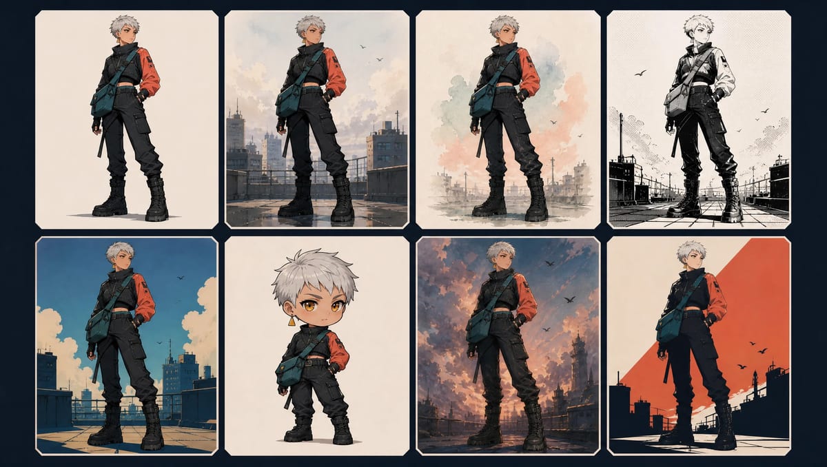
Style matrix applying eight visual directions to the same original character design.
People often use “style” for several kinds of classification.
| Label | What it describes | Character example |
|---|---|---|
| Character design | Stable visual identity | face, hair, body, outfit, palette placement, signature details |
| Visual style | How the design is rendered | linework, shading, texture, color treatment, lighting |
| Genre | Story conventions | romance, fantasy, mystery, sports, science fiction |
| Demographic | Intended audience category | shoujo, shounen, seinen, josei |
| Production technique | How images are produced | cel animation, digital painting, 3D, ink drawing |
Demographic labels can correlate with visual conventions in particular works. They do not define a single universal drawing style. Shoujo, for example, primarily describes a target demographic; individual shoujo works can use very different proportions, line qualities, color systems, and production techniques.
Keeping the labels separate improves the brief:
Proportion includes:
Changing proportion may affect character identity as well as style. Test it carefully when the same character needs to remain recognizable.
Linework may be:
Clear linework often supports technical design review. Softer or partly painted boundaries can support mood and material richness.
Color treatment may use:
The character’s palette placement should remain stable when style is the only variable.
Possible treatments include:
Lighting can change the apparent colors. Preserve a neutral reference version when exact palette communication matters.
Texture may be:
Detail density should match the output size. Fine texture can disappear or become noise in thumbnails and distant shots.
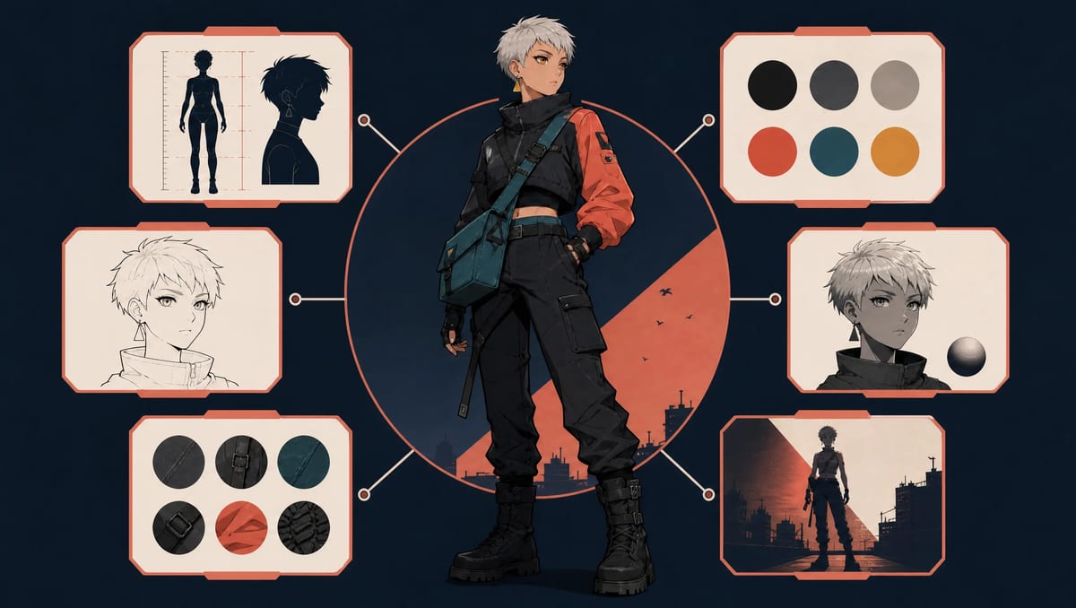
Five visual controls—proportion, linework, color, shading, and texture—shown on one character.
The following categories are working directions rather than an official universal taxonomy. Each one can contain many variations.
Visual grammar
Best for
Full-body character design, reference views, visual-novel assets, webtoon planning, and production material where construction needs to remain visible.
Watch out for
Cel shading can expose a generic silhouette. The rendering method cannot substitute for a clear underlying design.
Neutral prompt block
Crisp dark linework, flat restrained local colors, one clean cel-shadow shape, minimal surface texture, readable face and garment boundaries.
Visual grammar
Best for
Character key art, posters, dramatic story moments, environment-linked concepts, and presentation images.
Watch out for
Atmosphere, flare, and dense material detail may obscure seams and small identity cues. Keep a cleaner reference asset alongside the key art.
Neutral prompt block
Detailed cinematic anime illustration, motivated side light and restrained rim light, controlled atmospheric depth, rich material rendering, clear face and outer costume silhouette.
Visual grammar
Best for
Intimate portraits, quiet moments, storybook concepts, natural environments, and emotional presentation art.
Watch out for
If every boundary dissolves, clothing construction becomes difficult to inspect. Request controlled edges around the face, hands, and major garment shapes.
Neutral prompt block
Controlled translucent watercolor washes, subtle cold-press paper texture, diffuse overcast light, soft color transitions, selected crisp edges around the face and clothing.
Visual grammar
Best for
Character line studies, monochrome comics, expression work, value testing, and checking whether a design remains readable without color.
Watch out for
Color-based identity cues disappear. Hair silhouette, outfit structure, and value grouping must carry more recognition.
Neutral prompt block
Black-and-white manga ink, confident contour lines, large graphic shadow shapes, sparse controlled hatching, clean negative space, readable costume construction.
If the finished panel will move, use the manga panel animation workflow to preserve ink contours, screentone, borders, and typography while adding restrained motion.
Visual grammar
Best for
Nostalgic promotional art, retro science fiction, music visuals, and projects that need an older production feeling.
Watch out for
“Retro” includes many decades and technical processes. Specify the palette, grain, line quality, and simplification level instead of treating it as one look.
Neutral prompt block
Retro television-anime production look, simplified readable shapes, limited muted palette, restrained highlights, subtle analog grain, clean character silhouette.
Visual grammar
Best for
Mascots, reaction images, stickers, icons, comedy beats, and small-size assets.
Watch out for
Chibi changes body proportions substantially. Some clothing details need to be simplified, enlarged, or removed rather than copied at the original scale.
Neutral prompt block
Super-deformed anime mascot proportions, large expressive head, compact body, simplified limbs, bold readable costume shapes, clean flat color.
Visual grammar
Best for
Fantasy concept art, book-cover presentation, character key art, and mood-rich development images.
Watch out for
Painterly rendering may reinterpret seams, accessories, and color placement. Keep the silhouette and identity anchors explicit.
Neutral prompt block
Painterly fantasy anime concept art, layered brush texture, soft atmospheric light, rich but controlled materials, clear face and outer silhouette.
Visual grammar
Best for
Social graphics, title cards, music art, posters, mascots, and images that must remain readable at small size.
Watch out for
Fine material differences disappear. Use shape, value, and color placement rather than subtle texture.
Neutral prompt block
Bold graphic anime illustration, heavy clean outlines, limited flat palette, sharp high-contrast shadows, strong negative space, poster-like silhouette.
Use one stable design block:
Mara Vale, young adult rooftop courier, compact athletic build, cropped silver hair, amber eyes, short charcoal jacket with one coral left sleeve, teal cross-body satchel, triangular amber earring on the left ear, heavy black boots.
Keep the following fixed:
Change only the style block.
Review the results with two columns:
| Character design should remain | Visual style may change |
|---|---|
| face and apparent age | line weight |
| cropped hair silhouette | edge softness |
| body build and proportions | shading method |
| jacket construction | lighting treatment |
| coral left sleeve | color saturation |
| teal satchel | texture and grain |
| left-ear earring | detail density |
If the jacket becomes a coat or the satchel moves into a backpack, the character design changed. If the edges soften and the shadows become translucent while the outfit remains recognizable, the style test is working.
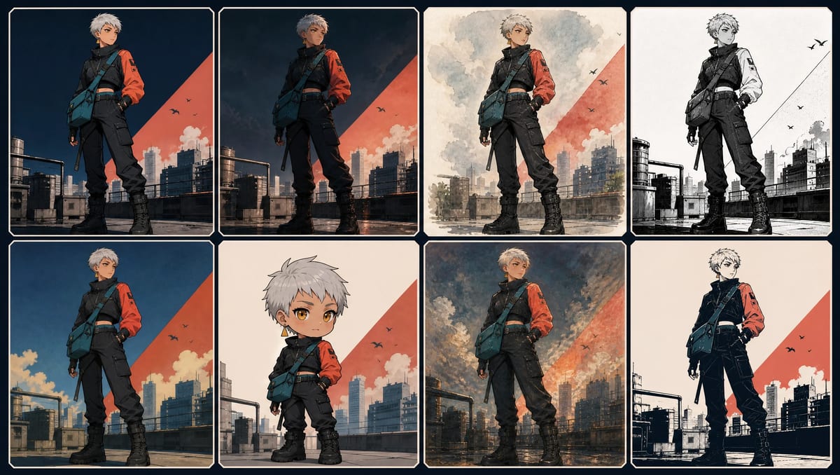
Controlled comparison that keeps the character identity stable while changing the visual treatment.
| Asset | Prioritize | Useful starting directions | Main risk |
|---|---|---|---|
| Full-body design | silhouette and garment clarity | clean cel, graphic | generic rendering if design is weak |
| Reference sheet | stable proportions and boundaries | clean cel, controlled ink | texture obscuring construction |
| Visual-novel portrait | face and upper-body readability | clean cel, soft watercolor | lower-body identity receiving little development |
| Webtoon panel | repeatability and clear color | clean cel, graphic | high detail becoming expensive to repeat |
| Storyboard keyframe | action and composition | manga ink, clean cel | polishing before the shot works |
| Poster / key art | light, material, atmosphere | cinematic, painterly | losing technical design clarity |
| Mascot / icon | small-size silhouette | chibi, graphic | too many tiny details |
No direction is best for every job. Select the visual treatment after defining the deliverable.
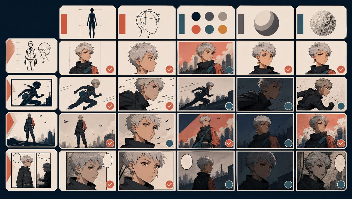
Style-selection matrix matching common character assets with practical visual priorities and risks.
An artist or studio name often acts as shorthand for several unspoken qualities. Replace the name with the qualities you need:
Instead of:
Draw this character in the style of [artist or studio].
Use:
Lightly stylized human proportions, thin precise linework, muted teal and warm coral palette, one clean cel-shadow layer, diffuse overcast light, minimal texture, readable full-body silhouette.
The second version is more editable. It also avoids making another creator’s identity the only instruction.
“Flat cel animation, thick oil paint, delicate ink wash, photoreal material” gives competing surface instructions. Choose a primary medium and one supporting quality.
“Fantasy anime” describes subject matter more than rendering. Add line, color, shading, light, and texture decisions.
Lock the design block. If several variables move together, you cannot tell which change caused the result.
Test the output at the actual publishing size. A texture that looks impressive at 2K may become noise in a small card.
Key art can hide garment boundaries and neutral color. Keep a clear design or reference asset alongside it.
The MkAnime AI anime character creator currently offers a focused comparison path:
Example MkAnime style selection shown beside the resulting full-body and multi-view character assets.
Use the anime character prompt template to separate design and style fields. Use the anime character design checklist if the identity itself still needs revision. For a single scene illustration rather than a character bundle, use the AI anime image generator.
There is no single official list. Practical directions include clean cel shading, cinematic detail, watercolor, manga ink, retro television anime, chibi, painterly fantasy, and graphic high contrast. Each direction contains many variations.
Shoujo primarily identifies a target demographic. Many shoujo works share selected visual conventions, but they do not use one universal style. Describe the actual proportion, linework, color, shading, and decorative treatment you need.
Cel-shaded art uses flat local colors with one or more clearly separated shadow shapes. It often keeps facial features, costume boundaries, and silhouettes readable, which makes it useful for character-design assets.
Describe translucent washes, paper grain, diffuse light, soft color transitions, and selected crisp edges around important facial and garment features. State the required framing separately.
Yes. Keep the face, hair, body, outfit, palette placement, and signature details fixed, then change only the style block. Review the outputs because generated images may still introduce character-design drift.
Anime contains many visual languages. Define an art direction through proportion, linework, color, shading, and texture, then choose it according to the job of the image.
Keep the character design fixed. Change one style variable at a time. Document the inputs and inspect the actual output rather than relying on a label alone.
Sonya is a contributor to MkAnime and works on content research, product communication, and practical AI-anime production workflows.
From inspiration to complete plot, quickly output chapter structure